Responsive Design
Quick Definition
Responsive design is a web design approach that makes your website automatically adapt to any screen size — desktop, tablet, or mobile. It uses CSS media queries and flexible layouts to ensure your WordPress site looks and works great on every device.
What Is Responsive Design?
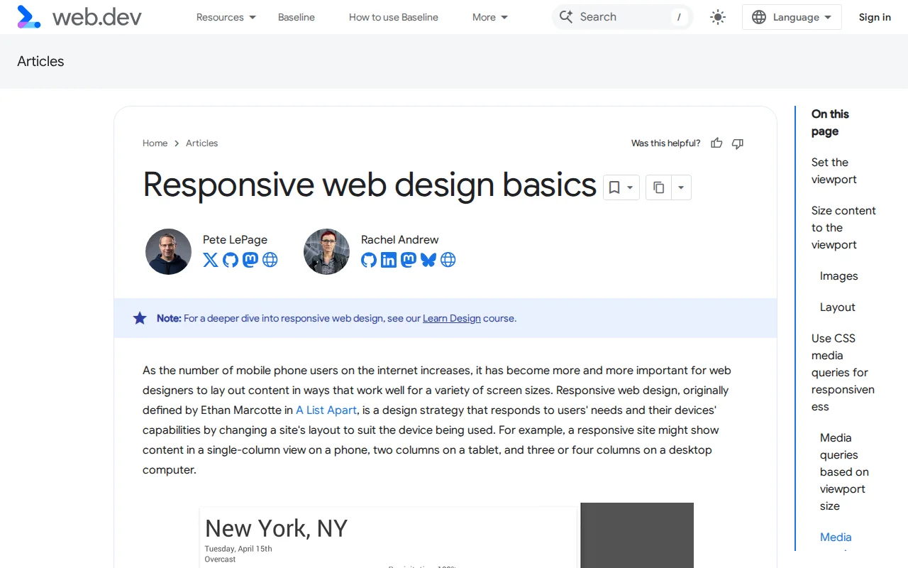
Responsive design makes websites automatically adjust layout, content, and visuals based on screen size. One site, all devices. Google uses mobile-first indexing — your mobile experience determines rankings. Over 60% of traffic is mobile.
How It Works
- Viewport meta tag — Tells browser to match device width
- Media queries — CSS rules for specific breakpoints
- Flexible layouts — % widths, Grid, Flexbox instead of fixed pixels
Common Breakpoints
| Device | Width |
|---|---|
| Mobile | 320-480px |
| Tablet | 481-768px |
| Laptop | 769-1024px |
| Desktop | 1025px+ |
WordPress
Modern themes (Astra, GeneratePress, Kadence) are responsive by default. Test on real devices, optimize images with lazy loading, and check mobile navigation.
Why It Matters
Mobile-first indexing = mobile experience determines rankings. 53% leave if page takes >3s on mobile. No excuse for non-responsive in 2026.